Design Systems That Scale: How to Build Consistent Digital Experiences as You Grow
As websites and digital products grow, inconsistency tends to creep in.
One page uses a slightly different button. Another introduces a new spacing pattern. A new feature adds another shade of the same brand color. Designers create new solutions, developers implement their own variations, and over time the experience starts to feel less connected.
That is where design systems that scale become valuable.
A scalable design system creates shared rules, reusable components, and documented standards that help teams design and build consistently as products evolve.
The goal is not to make every page look identical.
The goal is to create consistency where consistency matters, so teams can spend less time solving the same interface problems repeatedly and more time focusing on useful, meaningful improvements.
What Is a Design System?
A design system is a shared collection of design principles, reusable components, visual rules, documentation, and implementation standards used to create consistent digital experiences.
It helps answer questions such as:
- What colors should we use?
- How should buttons behave?
- What spacing values are acceptable?
- How should forms look and respond?
- Which component should be used in a specific situation?
- How should designers and developers implement the same pattern consistently?
A design system can include visual foundations such as color and typography, reusable interface components, accessibility rules, motion patterns, documentation, and even processes for deciding when new components should be added.
It is also important to understand what a design system is not.
A design system is not simply:
- A Figma file
- A collection of UI screens
- A folder of buttons
- A brand guideline document
- A component library by itself
Those things can all be part of the system, but the system becomes valuable when the pieces are connected by clear rules and shared understanding.
Why Design Systems Become More Important as You Grow
A small website can often stay consistent through careful design and reusable styles.
The problem becomes more complicated as the digital experience expands.
A growing business may eventually have:
- More website pages
- More landing pages
- More products
- More features
- A web application
- A mobile application
- Multiple designers
- Multiple developers
- Different teams working on different areas
- More frequent releases
Every addition creates another opportunity for inconsistency.
Without a shared system, each person may make a reasonable decision individually while still creating an inconsistent experience overall.
Fewer Repeated Decisions
Teams should not have to redesign common interface patterns every time they appear.
If the system already defines how buttons, forms, cards, navigation, alerts, and other common elements work, those decisions can be reused.
That reduces unnecessary design and development work.
More Consistent User Experiences
Users learn how interfaces work through repetition.
If the same type of button looks and behaves differently across pages, the experience becomes less predictable.
A consistent system makes familiar actions feel familiar wherever they appear.
Easier Collaboration
Designers and developers often work from different tools and perspectives.
A good system gives both sides a shared reference.
Designers understand what can be reused. Developers understand how components should behave.
Both teams can work from the same foundation instead of interpreting each screen independently.
Faster Expansion
When the foundations already exist, new pages and features do not need to start from zero.
Teams can combine established patterns and focus their attention on what is actually new.
A Design System Is More Than a Component Library
A component library and a design system are closely related, but they are not the same thing.
A component library contains reusable interface pieces.
These might include:
- Buttons
- Cards
- Form inputs
- Navigation
- Tabs
- Modals
- Alerts
A design system includes those components, but it also explains the decisions behind them.
It can include:
- Design principles
- Design tokens
- Typography rules
- Color rules
- Spacing systems
- Accessibility standards
- Interaction patterns
- Usage guidelines
- Documentation
- Governance
A component tells you what is available.
A design system also helps explain when, why, and how to use it.
That difference becomes increasingly important as more people begin using the same system.
The Core Parts of a Scalable Design System
The exact structure will vary from one company to another, but most scalable design systems include several foundational elements.
Design Principles
Design principles define the thinking behind the digital experience.
They might include ideas such as:
- Clear over clever
- Accessible by default
- Consistent but flexible
- Mobile-friendly
- Simple where possible
- Useful before decorative
These principles help teams make decisions when the system does not provide an exact answer.
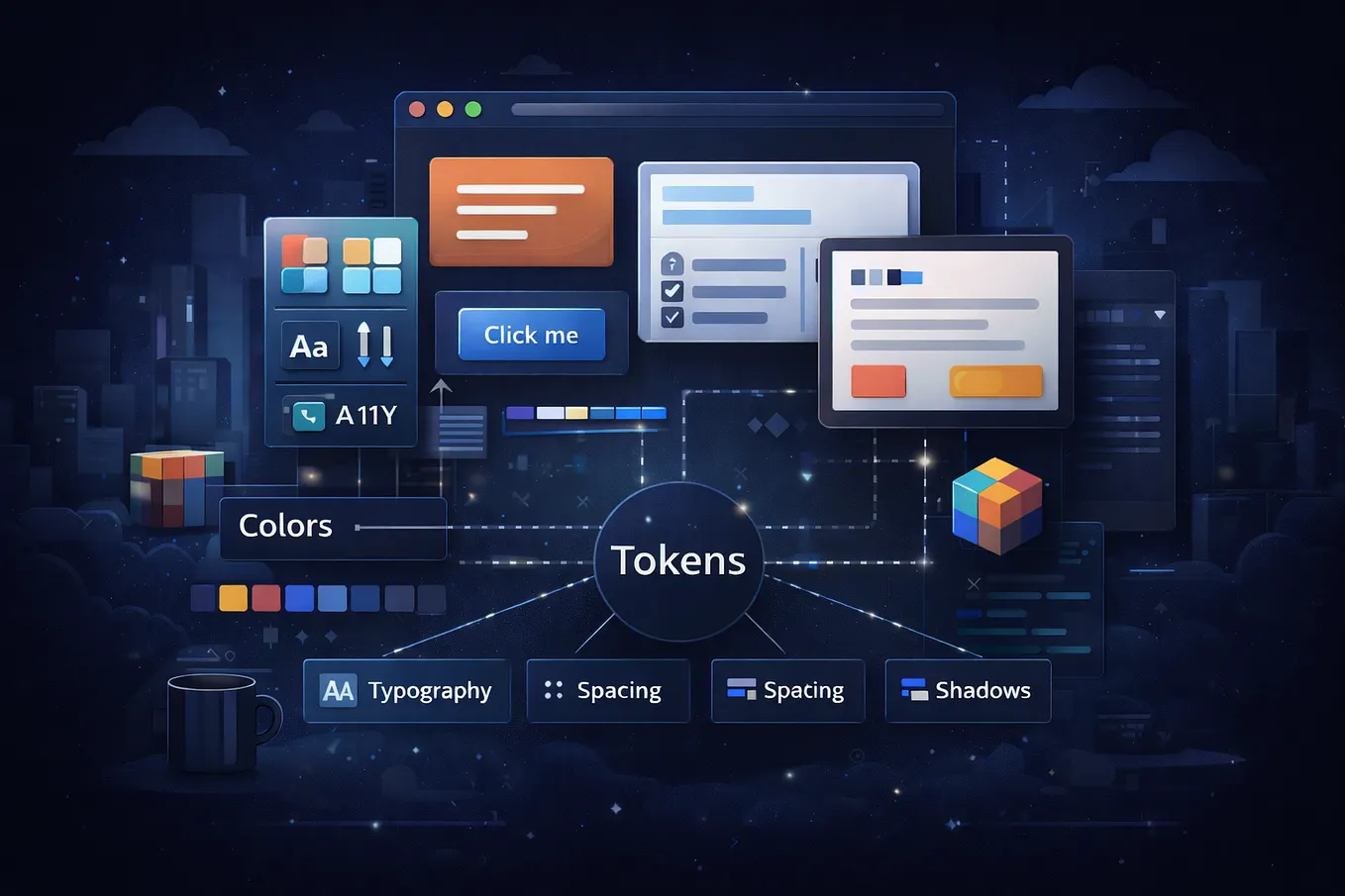
Design Tokens
Design tokens are reusable names for visual decisions.
They can represent values such as:
- Colors
- Font sizes
- Line heights
- Spacing
- Border radius
- Shadows
- Motion timing
Instead of manually entering the same color or spacing value in dozens of places, the team uses a reusable token.
For example, instead of repeatedly entering one specific blue value, the system might define a token called Primary Brand.
That token can then be used throughout components and interfaces.
If the brand color changes later, the system can update from one controlled source rather than requiring hundreds of manual edits.
Typography and Color Systems
Typography and color should not appear randomly inside a digital interface.
They should connect back to the visual identity of the brand.
A scalable system defines things such as:
- Primary and secondary colors
- Background colors
- Text colors
- Heading sizes
- Body text styles
- Font weights
- Line heights
These foundations create consistency before individual components are even designed.
This is also where a strong logo and brand identity system becomes important. Brand decisions around color, typography, and visual language can provide the foundation that later gets translated into reusable digital rules.
Reusable UI Components
Components are one of the most visible parts of a design system.
Common examples include:
- Buttons
- Form fields
- Cards
- Navigation
- Tabs
- Modals
- Tooltips
- Alerts
- Accordions
- Tables
A scalable component usually includes more than one visual state.
A button, for example, may need:
- Default
- Hover
- Focus
- Active
- Disabled
- Loading
A form input may need:
- Default
- Focus
- Error
- Success
- Disabled
These states should be designed and documented rather than invented independently every time.
Layout and Spacing Rules
Spacing is one of the easiest places for inconsistency to appear.
Without a shared spacing system, teams often end up using slightly different values everywhere.
One section uses 20 pixels. Another uses 24. Another uses 30 because it “looked better.”
A defined spacing scale reduces those arbitrary decisions and gives layouts a more consistent rhythm.
Interaction and Motion Patterns
Animation and interaction can also become inconsistent.
A design system can define:
- Transition speed
- Hover behavior
- Loading states
- Modal movement
- Menu transitions
- Feedback animations
The goal is not to animate everything.
It is to make interactive behavior feel intentional and predictable.
Accessibility Standards
Accessibility should not be added as an afterthought.
A scalable system should consider things such as:
- Color contrast
- Keyboard navigation
- Focus states
- Touch target sizes
- Readable text
- Form labels
- Error messages
When accessibility is built into reusable components, every page using those components benefits.
Documentation
A component can still be used incorrectly if nobody understands its purpose.
Good documentation explains:
- What the component is
- When to use it
- When not to use it
- Which variants are available
- How it behaves
- Accessibility considerations
- Content guidelines where relevant
Documentation becomes more important as the number of people using the system grows.
How Design Tokens Help a Design System Scale
Design tokens are one of the most important parts of a scalable design system because they centralize repeated decisions.
Think of the relationship like this:
Brand decision → Design token → Component → Interface
For example, your visual identity defines a primary brand blue. That becomes a reusable color token. That token is used in the primary button component. That button then appears across the website, application, or product.
If the brand color changes later, the token can be updated centrally.
The same idea can apply to:
- Typography
- Spacing
- Radius
- Shadows
- Motion
- Themes
This creates a more controlled system and reduces the risk of different parts of the product drifting apart visually.
Design System vs. Brand Guidelines
Brand guidelines and design systems are connected, but they solve different problems.
Brand Guidelines
Brand guidelines define how a brand should present itself.
They may include:
- Logo usage
- Color palette
- Typography
- Imagery
- Tone of voice
- Visual style
Their purpose is to protect brand consistency across different touchpoints.
Design System
A design system takes many of those principles and translates them into reusable digital behavior.
For example, a brand guideline might say: this is our primary brand color.
A design system might define: this color is used for primary actions, with specific hover, focus, disabled, and contrast states.
The brand guideline establishes the identity. The design system operationalizes that identity inside digital interfaces.
That is why a strong digital system often begins with a clear brand identity rather than trying to invent visual decisions inside the product itself.
Design System vs. Component Library
The difference can be summarized simply:
| Component Library | Design System |
|---|---|
| Reusable UI components | Complete design framework |
| Focuses on interface pieces | Focuses on the full system |
| May have limited guidance | Includes documentation and rules |
| Often implementation-focused | Connects design and development |
| Can exist independently | Usually includes components |
A component library can still be extremely useful.
It becomes more scalable when it is supported by shared foundations, documentation, and governance.
How to Build a Design System That Can Scale
A scalable system does not need to begin as a massive project.
In fact, trying to create everything at once is often one of the biggest mistakes teams make.
1. Audit What Already Exists
Start by reviewing the current website or product.
Look for:
- Duplicate buttons
- Similar but inconsistent components
- Multiple color values
- Different spacing rules
- Repeated layouts
- Conflicting interaction patterns
The goal is to understand where inconsistency already exists.
2. Define the Foundations
Before building components, establish the basic rules.
This may include:
- Typography
- Color
- Spacing
- Grid
- Radius
- Iconography
- Motion
These foundations should support both the brand and the user experience.
3. Create Design Tokens
Turn repeated visual decisions into reusable values.
Tokens make it easier to maintain consistency and update the system later.
Start with the decisions that appear most often.
4. Build the Most Common Components First
Do not try to build every possible component on day one.
Start with the elements teams use constantly, such as:
- Buttons
- Inputs
- Cards
- Navigation
- Common content sections
Build what creates immediate value.
5. Document How Components Should Be Used
Documentation should explain more than what something looks like.
Include:
- Purpose
- Variants
- States
- Usage
- Restrictions
- Accessibility requirements
Clear guidance reduces misuse.
6. Connect Design and Development
A design system cannot scale if the design file and the actual product become two separate realities.
If the button looks one way in Figma but behaves differently in the live website, the system is already drifting.
Designers and developers should work from shared rules and keep components aligned between design and implementation.
This is one of the reasons a thoughtful web design and development process should connect UI decisions with how those decisions are actually built and maintained.
7. Create a Contribution Process
As the product grows, new needs will appear.
Teams should understand:
- When a new component is necessary
- When an existing component should be reused
- Who reviews additions
- Who approves changes
- How updates are documented
Without a contribution process, the system can slowly become cluttered with unnecessary variations.
8. Maintain the System
A design system is not something you finish once and never touch again.
Products change. Brands evolve. Accessibility expectations improve. New use cases appear.
The system should evolve with them.
Common Reasons Design Systems Fail
Even well-designed systems can fail if they are not managed properly.
Building Too Much Too Early
Not every project needs dozens of components and hundreds of documented rules.
Start with the patterns that are used most often. Scale the system as the need grows.
Creating Components Without Clear Rules
A reusable component is only helpful when people understand how to use it.
Without guidance, teams may still create inconsistent variations.
Letting Design and Development Drift Apart
A system can look perfect in a design tool and still fail in implementation.
The designed component and coded component need to remain aligned.
Making the System Too Rigid
A design system should create consistency without preventing useful experimentation.
Consistency does not mean sameness.
Not every page should use the exact same layout. Not every experience should be forced into one rigid pattern.
A good system standardizes the decisions that should remain consistent while leaving flexibility where variation adds value.
Failing to Document Decisions
If only one designer understands why the system works the way it does, the system will struggle when the team expands.
Documentation makes knowledge reusable.
Having No Ownership
Someone needs responsibility for the health of the system.
Without ownership, outdated components remain in use, duplicate patterns appear, and standards slowly lose meaning.
When Does a Business Actually Need a Design System?
Not every website needs a large formal design system.
A simple business website with five pages, one designer, and a limited number of interface patterns may only need:
- Brand guidelines
- Reusable styles
- A small component set
- Clear layout rules
That may be enough.
A more complete design system becomes increasingly valuable when a business has:
- A growing website
- A web application
- A mobile application
- Multiple digital products
- Frequent feature releases
- Repeated UI patterns
- Multiple designers
- Multiple developers
- Multiple brands or themes
- A product expected to evolve over time
The right level of system should match the actual complexity of the business.
A design system should solve problems, not create unnecessary process.
How Design Systems Improve Web Design and Development
A well-built design system can improve both the design process and the development process.
Faster Design
Designers can reuse tested patterns rather than rebuilding familiar elements repeatedly.
More Predictable Development
Developers have clearer specifications and reusable components.
They do not need to interpret every screen as a completely new problem.
Better Visual Consistency
Buttons, forms, typography, spacing, and other patterns remain connected across pages.
Easier Maintenance
When the system changes, updates can often be made more efficiently.
A shared rule is easier to maintain than dozens of independent decisions.
Stronger Responsive Design
Components can include defined responsive behavior instead of forcing teams to solve mobile layouts repeatedly.
Easier Expansion
When a website or digital product grows, new experiences can build from established foundations.
That makes future growth more manageable.
At Ataraxia Solutions, we approach digital experiences as connected systems rather than isolated screens. Brand identity, UI/UX, development, and maintainability all work better when they support the same underlying structure.
A Good Design System Makes Consistency Easier, Not Creativity Harder
The purpose of a design system is not to eliminate creativity.
It is to remove unnecessary repeated decisions.
A designer should not have to decide how a standard button works for the fiftieth time.
A developer should not have to rebuild the same form pattern differently on every page.
Those problems can already be solved by the system.
That creates more room for teams to focus on the places where creative thinking actually adds value:
- New experiences
- Better interactions
- Clearer content
- More useful features
- Real user problems
A scalable design system creates boundaries where consistency matters and freedom where creativity adds value.
That balance is what allows digital experiences to grow without losing the qualities that made them effective in the first place.
Building a Digital Experience That Needs Room to Grow?
Whether you are building a new website, expanding an existing digital product, or trying to create more consistency across your digital presence, the right system can make future growth easier.
Explore our Web Design & Development services to see how strategy, interface design, development, and long-term scalability can work together.
If you already have a project in mind, talk to our team about what you are building and where it needs to go next.
Frequently Asked Questions About Design Systems
What is a design system?
A design system is a shared collection of design principles, reusable components, visual rules, documentation, and implementation standards that help teams create consistent digital experiences.
What is the difference between a design system and a component library?
A component library contains reusable interface elements such as buttons, forms, and cards. A design system includes those components plus the foundations, rules, documentation, accessibility standards, and processes that explain how the system should be used and maintained.
What are design tokens?
Design tokens are reusable names for design decisions such as colors, typography, spacing, border radius, shadows, and motion. They help teams apply the same visual values consistently across components and interfaces.
What should a design system include?
A scalable design system may include design principles, tokens, typography, color, spacing, reusable UI components, interaction patterns, accessibility standards, documentation, and governance.
Does every website need a design system?
No. A small website with limited pages and interface patterns may only need strong brand guidelines, reusable styles, and a small component set. A more formal design system becomes valuable as websites, products, and teams become more complex.
How does a design system help developers?
A design system gives developers reusable components, clear specifications, defined interaction states, and consistent visual rules. This can reduce repeated work, improve consistency, and make future updates easier to maintain.